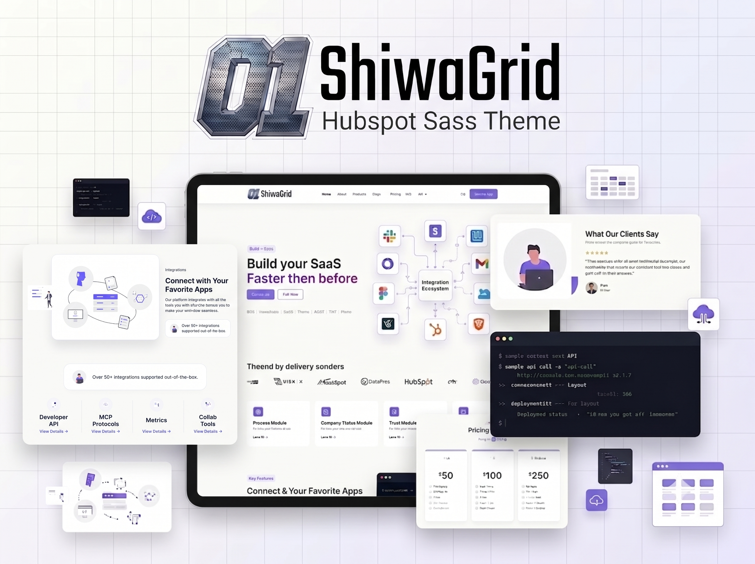
Theme Overview
Welcome to your new Hubspot Theme for Sass related website powered by the ShiwaGrid theme!
We’ve designed ShiwaGrid to be intuitive, flexible, and empowering for you as a content editor. This guide will walk you through the basics of managing your website’s content, so you can easily update pages, add new sections, and keep your site looking fresh without needing to touch a single line of code.
What is ShiwaGrid?
ShiwaGrid is a custom HubSpot theme built with flexibility and ease of use in mind. It uses a modular approach, which means your web pages are constructed using individual building blocks called modules. You can think of modules as digital Lego pieces—you can stack them, rearrange them, and customize them to create the exact layout you need.
Getting Around
As a content editor, your primary workspace will be the HubSpot drag-and-drop page editor. Here’s a quick overview of how you’ll interact with the theme:
Drag and Drop: You can easily add new sections to your pages by dragging modules from the sidebar directly onto your page layout.
Point and Click Editing: To change text, swap out images, or adjust styling, simply click on the element you want to edit. A sidebar will appear with all the available options for that specific module.
Global Content: Some parts of your website, like the header (navigation menu) and the footer, are “Global Content.” This means when you update them in one place, those changes will automatically apply across your entire website.
Let’s dive in and start building!
Global Settings & Brand Kit
Before you start building individual pages, it’s highly recommended to configure your global theme settings and Brand Kit. This ensures that your brand colors, fonts, and logos are automatically applied across every module in the ShiwaGrid theme.
1. Setting Up Your Brand Kit
HubSpot uses your account’s Brand Kit to automatically populate default logos and colors into theme modules.
In your HubSpot portal, navigate to Marketing > Brand.
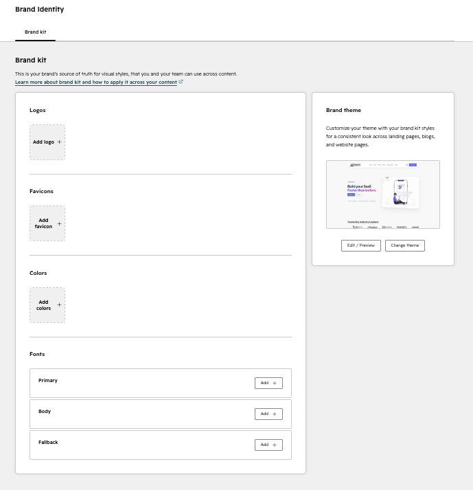
Click the Colors tab to set your primary brand colors.
Click the Logos tab and upload your company’s primary logo and favicon.
Note: If your Brand Kit is empty, some ShiwaGrid modules (like the Global Header) may display a “No logo” placeholder until you upload one or manually override it.
2. Editing Theme Settings
ShiwaGrid includes a robust global settings panel where you can control the typography, spacing, and default button styles for your entire website.
Open any page using the ShiwaGrid theme in the page editor.
In the left-hand sidebar, click the Edit Theme Settings button.

A new panel will open. Here you can configure:
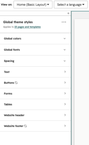
Colors: Set your primary, secondary, and background colors.
Typography: Choose your headings (H1-H6) and paragraph fonts. ShiwaGrid natively supports a wide range of modern web fonts.
Buttons: Define the default border radius, colors, and padding for your Primary and Secondary buttons.
Click Publish to apply these global changes across your entire website.
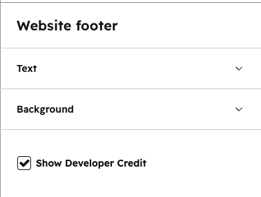
Developer Credit:ShiwaGrid allows you to remove developer credit. To remove developer credit, Open any page using the ShiwaGrid theme in the page editor, and click on edit theme settings, then click on Footer setting then Developer Credit and uncheck the Developer Credit checkbox.
Editing Global Content (Header & Footer)
Your website’s Header (navigation menu) and Footer are considered “Global Content.” Changes made here will automatically reflect on every page that uses them.
Editing the Header
Open any page (like your Home page) in the HubSpot page editor.
Click directly on the Header at the top of the page.

A prompt will appear in the left sidebar saying this is Global Content. Click Open in global content editor.
You are now editing the global header file. You can click on the logo module to change the image, or click on the menu module to add/remove navigation links.
Once you are finished, click Publish to [X] assets in the top right to push the changes live across all pages.
Editing the Footer
The process is exactly the same as the header:
Scroll down to the bottom of any page in the editor and click on the Footer.
Click Open in global content editor.
Here you can edit the footer logo, update the copyright text, and modify any footer navigation links or social icons.
Publish your changes when done.
Working with Full-Width Modules
ShiwaGrid is built using full-width, section-based custom modules. Instead of struggling with complicated column math or trying to squeeze content into tiny grid boxes, ShiwaGrid’s modules (like Features, Cards, and Pricing) are designed to span the full width of your page beautifully.
Here is how you can easily manage the layout of these modules:
1. Adding and Managing Content
For most modules in ShiwaGrid, you can easily add items (like a new feature card or a new pricing tier) using the repeater fields:
To add a new item, simply click Add under the module’s content options in the sidebar.
The module will handle the layout natively, ensuring the new items are spaced out correctly within the full-width section.
On smaller screens (like mobile phones), the content will automatically stack vertically so it remains highly readable.
2. Adjusting the Section Settings
If you want to control how much space the module takes up on the page:
Hover over the module and look for the Section wrapping it.
Click the Section, and in the left sidebar under Alignment and spacing, you can set maximum widths or margins to squeeze or stretch the container.
Because these are full-width modules, they look best when dropped directly into a full-width Drag-and-Drop area rather than inside a multi-column layout.
3. Styling Your Modules
When you click on a module, switch to the Styles tab in the sidebar. Here you can tweak the layout aesthetics:
Spacing: Adjust the padding inside the module.
Backgrounds: Set colors or background images for individual elements to make them pop.
Corners & Borders: Give your items a softer look with rounded corners or defined borders.
You have complete control over how the sections look and feel—all by pointing, clicking, and dragging!
Page Templates Guide
ShiwaGrid comes with several pre-designed templates out-of-the-box. These templates act as starting points for your pages, saving you time by providing an optimal layout that you can instantly start filling with your own content.
Below is a detailed guide on each standard template, its intended purpose, how to create it, and how to use its drag-and-drop areas.
1. Home Template (home.html)
Purpose: Designed for your primary landing experience. It’s built to grab attention immediately with a large hero banner, feature highlights, social proof (logos/testimonials), and clear calls-to-action.
How to Create: Go to Content > Website > Website Pages. Click Create > Website page, name it “Home”, select the ShiwaGrid theme, and choose the Home template.
Using Drag-and-Drop: The Home template features a massive vertical Drag-and-Drop area between the header and footer. You can freely drag custom ShiwaGrid modules like Hero Section, Features, and Company Status directly into the main body area to stack them exactly how you want.
2. About Template (about.html)
Purpose: Perfect for telling your company’s story, outlining your mission, and introducing your team members.
How to Create: Go to Content > Website > Website Pages. Click Create > Website page, name it “About Us”, select the ShiwaGrid theme, and choose the About template.
Using Drag-and-Drop: We recommend dragging the Alternate module into the editor for company history (staggered text/image splits) and dragging the Teams module below it to easily showcase your staff.
3. Services Template (services.html)
Purpose: A comprehensive layout to showcase your company’s offerings, highlight key features, build credibility through testimonials, and encourage prospects to take the next step.
How to Create: Go to Content > Website > Website Pages. Click Create > Website page, name it “Services”, select the ShiwaGrid theme, and choose the Services template.
Using Drag-and-Drop: The Services template includes a robust drag-and-drop area pre-populated with the Features, Alternate (staggered content), Trust (logos), and Testimonial modules. You can easily drag these sections up or down to reorder them, or add a Call-to-Action module at the very bottom to drive conversions.
4. Team Template (team.html)
Purpose: Dedicated to highlighting your leadership and staff, providing a personal touch to your brand while also displaying company status and trust signals.
How to Create: Go to Content > Website > Website Pages. Click Create > Website page, name it “Our Team”, select the ShiwaGrid theme, and choose the Team template.
Using Drag-and-Drop: Drag the Team module into the main area to display your staff grid. You can also utilize the Company Status module to highlight key company metrics or history, and the Trust module for displaying partner or client logos right below your team members.
5. Pricing Template (pricing.html)
Purpose: A dedicated layout to showcase your product or service tiers, highlight different features, and drive subscriptions.
How to Create: Go to Content > Website > Website Pages. Click Create > Website page, name it “Pricing”, select the ShiwaGrid theme, and choose the Pricing template.
Using Drag-and-Drop: Drag the Pricing or Pricing Card modules into the main content area. You can add a new Drag-and-Drop row right underneath your pricing tables to drop in an FAQ Items module to answer common buyer objections.
6. Contact Template (contact.html)
Purpose: Designed to help users get in touch. It pairs well with forms, location details, and social links.
How to Create: Go to Content > Website > Website Pages. Click Create > Website page, name it “Contact”, select the ShiwaGrid theme, and choose the Contact template.
Using Drag-and-Drop: Place the Contact Us module into the main drag-and-drop area. To create a split layout, drag a 2-column structure into the section. Place your HubSpot form in the left column, and drag the Info Social module into the right column to display your physical address and social links.
7. FAQ Template (faq.html)
Purpose: Designed to answer common customer questions clearly and concisely, while offering an immediate way to get in touch if their question isn’t listed.
How to Create: Go to Content > Website > Website Pages. Click Create > Website page, name it “FAQ”, select the ShiwaGrid theme, and choose the FAQ template.
Using Drag-and-Drop: Drop the FAQ module into the main section to easily manage collapsible question-and-answer accordions. Below the FAQs, you can drag the Contact section or a Call-to-Action module to catch users who still need assistance.
8. Landing Page Template (landing-page.html)
Purpose: A distraction-free template (typically without top navigation or a complex footer) meant specifically for marketing campaigns (e.g., ad destinations or lead magnet downloads) to drive high conversion rates.
How to Create: Go to Content > Landing Pages. Click Create > Landing page, name your campaign, select the ShiwaGrid theme, and choose the Landing Page template.
Using Drag-and-Drop: Keep it simple! Drag a Hero Section to the top, or use the Alternate module to highlight the benefits of your offer. Because there is no header navigation to distract users, visitors are funneled straight into the content modules you drag onto the page.
9. Blank Template (blank.html)
Purpose: Provides a true, empty drag-and-drop canvas for content creators who want to build a page entirely from scratch without any predefined sections.
How to Create: Go to Content > Website > Website Pages. Click Create > Website page, name it your desired page name, select the ShiwaGrid theme, and choose the Blank template.
Using Drag-and-Drop: The entire body is an empty drag-and-drop zone. You can drag any ShiwaGrid module from the left sidebar—such as Hero Sections, Multi-column content, or Forms—to build a completely custom layout step-by-step.
Custom Modules & Configuration
ShiwaGrid is packed with over 20 highly customizable modules. Rather than using generic text blocks, you can use these modules to quickly build professional layouts. Below is a guide to the key modules included in your theme, what they do, and how to configure them in the left-hand sidebar editor.
1. Core Layout & Content Modules
Hero Section
What it does: Creates a stunning, high-impact introductory banner at the top of your page.
How to configure: Click the module to edit the Heading, Sub-text, Badge Text, and button links. You can also upload
a Hero Mockup image (like an app dashboard).
Visual Tip: Always place this in a full-width section at the very top of your Home or Landing pages.
Features
What it does: Displays your core product or service highlights in a clean grid.
How to configure: Use the Feature Cards repeater to add as many features as you need. For each card, upload a small icon
and enter a title/description.
Visual Tip: Keep your feature descriptions roughly the same length so the grid rows align perfectly.
Alternate
What it does: Displays alternating rows of text on one side and an image/media on the other (e.g., Image-Text, then Text-Image).
How to configure: Add Alternate Blocks in the sidebar and fill in the text and image for each row.
Visual Tip: Great for deep-diving into complex product features down the middle of a page.
Process
What it does: Creates a timeline or step-by-step flow (e.g., “How it Works in 3 Steps”).
How to configure: Add Process Steps one by one, defining the step number, title, and description.
2. Social Proof & Trust Modules
Trust (Logo Marquee)
What it does: A scrolling marquee of client or partner logos.
How to configure: Open the Splide Slide repeater and add your logo image files.
Visual Tip: Use monochromatic or grayscale logos for a cleaner, more premium look.
Testimonial
What it does: An elegant slider to showcase customer quotes and reviews.
How to configure: Add items to the Testimonials list. You’ll need the customer’s quote, name, title, and a small avatar
image.
Company Status
What it does: A dedicated section to show off your company’s impressive numbers (e.g., “1M+ Users”) and industry awards.
How to configure: Fill out the Stats Items (number and label) and upload award badges under Awards Group.
3. Conversion & Pricing Modules
Pricing / Pricing Card
What it does: Creates beautiful pricing tier tables.
How to configure: You can define Pricing Plans (the tier name, price, and frequency) and list the individual features
included in each tier. Don’t forget to set the Checkout Behavior and button links!
Visual Tip: Give your “Pro” or “Most Popular” tier a different background color in the Styles tab to make it pop.
Contact Us
What it does: A styled wrapper for your HubSpot forms.
How to configure: Enter a heading and description, then select an existing form from your HubSpot portal using the Form
Field dropdown.
4. SaaS & Tech Specific Modules
Integration
What it does: Visually showcases how your software connects with other popular apps.
How to configure: Upload a Main App Mockup and then add small icons to the Track Items list to represent third-party
apps (like Slack, Google, etc.).
Terminals
What it does: Displays developer-friendly code snippets in a stylized “Terminal” window.
How to configure: Use the Playbook Tabs to add different code snippets users can toggle between.
5. Utility & Navigation Modules
Shiwa Button & Button Wrap: Standalone buttons. Simply configure the link, text, and button style (primary vs.
secondary).
FAQ Items: Creates an expandable accordion for Frequently Asked Questions. Just add your questions and answers to the FAQ Items repeater list.
Teams: Showcase your team members with their names, roles, and social media links.
Breadcrumb: Adds a breadcrumb navigation trail (e.g., Home > Services > Web Design). Best used at the very top of sub-pages.
Working with Drag-and-Drop Sections
ShiwaGrid fully supports HubSpot’s native Drag-and-Drop (DnD) area, giving you the freedom to build completely custom layouts on the fly without touching any code.
The Layout Hierarchy
When building a page, you are working with three main layers:
Sections: The outermost horizontal wrappers (e.g., a full-width background color or image).
Rows: Inside a section, rows stack content vertically.
Columns: Inside a row, columns allow you to split content side-by-side (e.g., placing text next to an image).
Best Practices for Layouts
Adding Modules: Open the Add tab in your left sidebar, find a ShiwaGrid module, and drag it directly into the column where you want it.
Section Styling: Hover over the edge of a section and click the Edit Style icon. Here you can add custom padding/margins, change the background color, or add a background image. ShiwaGrid provides a clean palette by default, but you can override this directly on the page.
Saved Sections: Built a perfect combination of modules? Hover over the section, click the Heart icon, and save it as a “Saved Section.” You can now drop this exact layout onto any other page in your portal instantly.
Setting up a Blog Page
ShiwaGrid comes with beautiful, conversion-optimized templates for both your main Blog Listing (the feed of articles) and the individual Blog Posts (blog-index.html and blog-post.html respectively).
Unlike regular website pages where you drag-and-drop structural elements, the blog templates are applied at the global blog settings level and operate dynamically.
Follow this step-by-step walkthrough to get your blog running on the ShiwaGrid theme:
Step 1: Assign the Templates in Settings
Click the Settings (gear icon) in the main navigation bar of your HubSpot portal.
On the left sidebar menu, navigate to Website > Blog.
Use the Select a blog to modify dropdown to choose which blog you are setting up (if you have multiple).
Click on the Templates tab.
Step 2: Set the Blog Post Template
Look for the Blog post section.
Click Change template (or Select a template if none is assigned).
Search or browse for the ShiwaGrid theme.
Select the blog-post.html template.
Step 3: Set the Blog Listing Template
Just below that, look for the Blog listing page section.
Ensure the checkbox for Use same template for blog listing page is unchecked (if applicable).
Click Change template.
Select the ShiwaGrid theme.
Choose the blog-index.html template.
Click Save at the bottom left of the settings screen.
How the Blog Listing Auto-Populates Content
Once you’ve assigned the blog-index.html template, you do not need to manually create new cards for your blog feed. The ShiwaGrid listing template runs on a dynamic loop. This means every time you publish a new blog post, the listing page will automatically pull the post’s Featured Image, Title, Publish Date, and Meta Description, wrapping them in a stylish card format at the top of your blog feed.
Step 4: Publish Your First Blog Post
Your blog is now configured! Let’s publish your first article using the ShiwaGrid design:
Navigate to Marketing > Website > Blog.
Click the orange Create button in the top right and select Blog post.
A blank post will open. Notice how it already matches the ShiwaGrid brand design (fonts, colors, spacing).
Fill in your Blog Title and start typing your article body. You can use standard formatting (bolding, lists, H2 headings) and insert images right into the rich text editor.
Click the Settings tab at the top of the editor.
Write a Meta Description (this acts as the preview summary on your listing page).
Upload a Featured Image (this acts as the thumbnail for the post card on your listing page).
Once you’re happy with the content, click Publish in the top right corner.
Navigate to your live blog listing URL, and you will see your new post automatically populated in the feed!
Managing System Pages
System Pages are functional pages that HubSpot automatically generates for you when a specific scenario occurs on your website—such as a visitor trying to access a broken link or a private page.
ShiwaGrid includes stylized templates for all of HubSpot’s core system pages to ensure a seamless, branded experience across every corner of your site.
1. What Triggers Each System Page?
Here are the most common system pages included in the ShiwaGrid theme and when they appear:
Error 404 (404.html): Triggered when a visitor clicks a broken link or types a URL that doesn’t exist on your site.
Error 500 (500.html): Triggered if there is an unexpected server error preventing a page from loading.
Password Prompt (password-prompt.html): Appears when a visitor tries to view a page that you have restricted with a password.
Search Results (search-results.html): Displays the search results when a user queries your site using the HubSpot Search module.
Email Subscriptions (subscription-preferences.html & backup-unsubscribe.html): Appears when a contact clicks the “Unsubscribe” or “Manage Preferences” link at the bottom of your marketing emails.
2. How to Preview and Edit System Pages
While system pages operate slightly differently from standard website pages, you can still edit their text and styling:
In your HubSpot portal, click the Settings (gear icon) in the main navigation bar.
In the left sidebar menu, navigate to Website > Pages.
Click on the System Pages tab.
Here you will see a list of your configured system pages (Error pages, Password prompt, etc.). If a template is assigned, you will see an Edit button next to it.
Click Edit to open the system page in the page editor, where you can modify the text, adjust styling, and publish your changes.
3. Mapping Your System Pages in Settings
For HubSpot to know which pages to show when an error or password prompt occurs, you must “map” them in your portal’s global settings:
Click the Settings (gear icon) in the main navigation bar.
In the left sidebar menu, navigate to Website > Pages.
Click on the System Pages tab.
For each category (e.g., 404 error page, 500 error page, Password prompt page, Search results page), click the dropdown.
If you haven’t created the system page yet, click Create new page, select the ShiwaGrid theme, and choose the corresponding template.
Click Save at the bottom of the screen.
Your website is now fully equipped to handle edge cases with style!
Deep Dive: The Alternate Module
1. What is the Alternate Module?
The Alternate module (alternate.module) is one of the most powerful and commonly used layout blocks in the ShiwaGrid theme. Its purpose is to display a list of features or benefits in a visually engaging “zig-zag” pattern—alternating between text on the left and an image on the right, and then automatically reversing on the next row. This breaks up long walls of text and is perfect for highlighting a product’s core features step-by-step.
2. Configuring the Sidebar Fields (Step-by-Step)
When you drag the Alternate module onto a page and click on it, the left sidebar will open. You will see a repeater list called Alternate Blocks. Click Add to create your first row, and configure the following fields:
Block Image: The visual asset for this specific row. What it does: Displays an image alongside your text. The module is smart enough to automatically position this on the left or right depending on which row you are currently editing.
Badge Text: A short, highlighted label. What it does: Appears in small, accented text directly above the main title (e.g., “New Feature” or “Pro Tip”).
Title: The main headline for this row. What it does: Displays as a prominent, bold heading to capture the reader’s attention.
Descriptions: A rich text editor block. What it does: This is the main body text explaining the feature in detail.
CTA Link: The destination URL. What it does: Controls where the user goes when they click the button at the bottom of
the text block. You can link to external sites, files, or internal HubSpot pages easily.
CTA Label: The button text. What it does: Sets the text inside the Call-to-Action button (e.g., “Learn More” or “Get
Started”).
3. Visual Tips for the Alternate Module
Keep text concise: For the best visual balance, try to keep the length of your Descriptions similar across all your alternate blocks. If one block has five paragraphs and the next has only one sentence, the zig-zag design will look lopsided.
Image consistency: Use images that have similar dimensions or aspect ratios. Transparent PNGs or SVG illustrations look fantastic in this layout as they float seamlessly next to the text on clean backgrounds!
Drag-and-Drop Placement: This module is designed to span the full width of its container. For the most premium look, drag the Alternate module into a full-width Section (rather than a tiny multi-column row) so the zig-zag layout has plenty of room to breathe.
Complete Module Field Reference
Click to expand and view the full field guide for all modules
Breadcrumb
Breadcrumb_Style (Repeater/Group): Click ‘Add’ to create a new item. For each item, configure:
Title_Color: Select a brand color using the color picker.
List_Color: Select a brand color using the color picker.
Button Wrap
Button_Wrap (Repeater/Group): Click ‘Add’ to create a new item. For each item, configure:
Button Label: Enter text for this field. Tip: Keep it short and impactful.
Button Link: Configure the destination link. You can link to an external URL, a file, or another HubSpot page.
Button Type: Select an option from the dropdown menu to adjust the style or behavior.
Shiwa Button
Button Link: Configure the destination link. You can link to an external URL, a file, or another HubSpot page.
Button Text: Enter text for this field. Tip: Keep it short and impactful.
Styles (Repeater/Group): Click ‘Add’ to create a new item. For each item, configure:
Text: This is a group of settings. Inside, you’ll find related fields to configure.
Background: This is a group of settings. Inside, you’ll find related fields to configure.
Border: This is a group of settings. Inside, you’ll find related fields to configure.
Corner: This is a group of settings. Inside, you’ll find related fields to configure.
Spacing: This is a group of settings. Inside, you’ll find related fields to configure.
Alignment: This is a group of settings. Inside, you’ll find related fields to configure.
Card
Card (Repeater/Group): Click ‘Add’ to create a new item. For each item, configure:
Image: Upload or select an image. Tip: Compress your images before uploading to maintain fast page speeds.
Content: Use the rich text editor to format your text (bold, links, lists). Tip: Don’t paste complex formatting directly from Word; use clear formatting.
Styles (Repeater/Group): Click ‘Add’ to create a new item. For each item, configure:
Image: This is a group of settings. Inside, you’ll find related fields to configure.
Card: This is a group of settings. Inside, you’ll find related fields to configure.
Company Status
Subheading: Enter text for this field. Tip: Keep it short and impactful.
Heading: Enter text for this field. Tip: Keep it short and impactful.
Description: Enter text for this field. Tip: Keep it short and impactful.
Stats Items (Repeater/Group): Click ‘Add’ to create a new item. For each item, configure:
Value: Enter text for this field. Tip: Keep it short and impactful.
Stats Label: Enter text for this field. Tip: Keep it short and impactful.
Awards Group (Repeater/Group): Click ‘Add’ to create a new item. For each item, configure:
Card Title: Enter text for this field. Tip: Keep it short and impactful.
Card Description: Enter text for this field. Tip: Keep it short and impactful.
Award Items: This is a group of settings. Inside, you’ll find related fields to configure.
Display_Awards_Card: Toggle this on or off to enable or disable the feature.
Contact Us
Heading: Enter text for this field. Tip: Keep it short and impactful.
Description: Enter text for this field. Tip: Keep it short and impactful.
Form_Field (Repeater/Group): Click ‘Add’ to create a new item. For each item, configure:
Form_Id: Enter text for this field. Tip: Keep it short and impactful.
Response_Title: Enter text for this field. Tip: Keep it short and impactful.
Submit_Button_Text: Enter text for this field. Tip: Keep it short and impactful.
Notifications_Are_Enabled: Toggle this on or off to enable or disable the feature.
Gotowebpage_Html: Enter text for this field. Tip: Keep it short and impactful.
faq_items
Badge Text: Enter text for this field. Tip: Keep it short and impactful.
Heading: Enter text for this field. Tip: Keep it short and impactful.
Subheading: Enter text for this field. Tip: Keep it short and impactful.
Team_Label: Enter text for this field. Tip: Keep it short and impactful.
Team Avatars: Upload or select an image. Tip: Compress your images before uploading to maintain fast page speeds.
Faq Items (Repeater/Group): Click ‘Add’ to create a new item. For each item, configure:
Question: Enter text for this field. Tip: Keep it short and impactful.
Answer: Use the rich text editor to format your text (bold, links, lists). Tip: Don’t paste complex formatting directly
from Word; use clear formatting.
Features
Heading: Enter text for this field. Tip: Keep it short and impactful.
Subheading: Enter text for this field. Tip: Keep it short and impactful.
Feature Cards (Repeater/Group): Click ‘Add’ to create a new item. For each item, configure:
Icon: Upload or select an image. Tip: Compress your images before uploading to maintain fast page speeds.
Icon_Gradient: Select a brand color using the color picker.
Title: Enter text for this field. Tip: Keep it short and impactful.
Description: Use the rich text editor to format your text (bold, links, lists). Tip: Don’t paste complex formatting directly from Word; use clear formatting.
Link: Configure the destination link. You can link to an external URL, a file, or another HubSpot page.
Card Link Label: Enter text for this field. Tip: Keep it short and impactful.
Hero Section
Badge Text: Enter text for this field. Tip: Keep it short and impactful.
Heading With Gradient Color: Enter text for this field. Tip: Keep it short and impactful.
Heading Plain: Enter text for this field. Tip: Keep it short and impactful.
Sub Text: Enter text for this field. Tip: Keep it short and impactful.
Hero Mockup: Upload or select an image. Tip: Compress your images before uploading to maintain fast page speeds.
Performance Stat: Enter text for this field. Tip: Keep it short and impactful.
Performance Label: Enter text for this field. Tip: Keep it short and impactful.
Primary Button (Repeater/Group): Click ‘Add’ to create a new item. For each item, configure:
Link: Configure the destination link. You can link to an external URL, a file, or another HubSpot page.
Text: Enter text for this field. Tip: Keep it short and impactful.
Secondary Button (Repeater/Group): Click ‘Add’ to create a new item. For each item, configure:
Link: Configure the destination link. You can link to an external URL, a file, or another HubSpot page.
Text: Enter text for this field. Tip: Keep it short and impactful.
Style (Repeater/Group): Click ‘Add’ to create a new item. For each item, configure:
Text Heading Gradient: Configure this gradient field.
Badge Text Color: Select a brand color using the color picker.
Social Text: Use the rich text editor to format your text (bold, links, lists). Tip: Don’t paste complex formatting directly from Word; use clear formatting.
Info Social
Contact_Info (Repeater/Group): Click ‘Add’ to create a new item. For each item, configure:
Email: Enter text for this field. Tip: Keep it short and impactful.
Location: Enter text for this field. Tip: Keep it short and impactful.
Social_Links (Repeater/Group): Click ‘Add’ to create a new item. For each item, configure:
Platform: Enter text for this field. Tip: Keep it short and impactful.
Url: Configure the destination link. You can link to an external URL, a file, or another HubSpot page.
Integration
Left Character Image: Upload or select an image. Tip: Compress your images before uploading to maintain fast page speeds.
Main App Mockup: Upload or select an image. Tip: Compress your images before uploading to maintain fast page speeds.
Subheading Badge: Enter text for this field. Tip: Keep it short and impactful.
Heading: Enter text for this field. Tip: Keep it short and impactful.
Description: Enter text for this field. Tip: Keep it short and impactful.
Callout Text: Enter text for this field. Tip: Keep it short and impactful.
Callout Avatar: Upload or select an image. Tip: Compress your images before uploading to maintain fast page speeds.
Track Items: Click ‘Add’ to create a new item. For each item, configure:
Icon Image: Upload or select an image. Tip: Compress your images before uploading to maintain fast page speeds.
Title: Enter text for this field. Tip: Keep it short and impactful.
Url: Configure the destination link. You can link to an external URL, a file, or another HubSpot page.
Link Text: Enter text for this field. Tip: Keep it short and impactful.
Shiwa Menu
Menu: Configure this menu field.
Max Levels: Enter a numerical value.
Styles (Repeater/Group): Click ‘Add’ to create a new item. For each item, configure:
Text: This is a group of settings. Inside, you’ll find related fields to configure.
Drop Downs: This is a group of settings. Inside, you’ll find related fields to configure.
News
Subheading: Enter text for this field. Tip: Keep it short and impactful.
Heading: Enter text for this field. Tip: Keep it short and impactful.
View_All_Link: Configure the destination link. You can link to an external URL, a file, or another HubSpot page.
View_All_Text: Enter text for this field. Tip: Keep it short and impactful.
Pricing card
Product Tier: Use the rich text editor to format your text (bold, links, lists). Tip: Don’t paste complex formatting directly from Word; use clear formatting.
Product Description: Use the rich text editor to format your text (bold, links, lists). Tip: Don’t paste complex formatting directly from Word; use clear formatting.
Features List Icon: Configure this icon field.
Features: Enter text for this field. Tip: Keep it short and impactful.
Price: Enter text for this field. Tip: Keep it short and impactful.
Price Timeframe: Enter text for this field. Tip: Keep it short and impactful.
Button Text: Enter text for this field. Tip: Keep it short and impactful.
Button Target: Select an option from the dropdown menu to adjust the style or behavior.
Button Link: Configure the destination link. You can link to an external URL, a file, or another HubSpot page.
Payment Link: Configure this payment field.
Checkout Behavior: Select an option from the dropdown menu to adjust the style or behavior.
Styles (Repeater/Group): Click ‘Add’ to create a new item. For each item, configure:
Features: This is a group of settings. Inside, you’ll find related fields to configure.
Price: This is a group of settings. Inside, you’ll find related fields to configure.
Button: This is a group of settings. Inside, you’ll find related fields to configure.
Card: This is a group of settings. Inside, you’ll find related fields to configure.
Pricing
Subheading Badge: Enter text for this field. Tip: Keep it short and impactful.
Heading: Enter text for this field. Tip: Keep it short and impactful.
Pricing Plans (Repeater/Group): Click ‘Add’ to create a new item. For each item, configure:
Plan Name: Enter text for this field. Tip: Keep it short and impactful.
Description: Use the rich text editor to format your text (bold, links, lists). Tip: Don’t paste complex formatting directly from Word; use clear formatting.
Monthly Price: Enter text for this field. Tip: Keep it short and impactful.
Yearly Price: Enter text for this field. Tip: Keep it short and impactful.
Price Subtext: Enter text for this field. Tip: Keep it short and impactful.
Features: This is a group of settings. Inside, you’ll find related fields to configure.
Button Link: Configure the destination link. You can link to an external URL, a file, or another HubSpot page.
Button Text: Enter text for this field. Tip: Keep it short and impactful.
Process
Heading: Enter text for this field. Tip: Keep it short and impactful.
Description: Enter text for this field. Tip: Keep it short and impactful.
Side Image: Upload or select an image. Tip: Compress your images before uploading to maintain fast page speeds.
Process_Steps (Repeater/Group): Click ‘Add’ to create a new item. For each item, configure:
Title: Enter text for this field. Tip: Keep it short and impactful.
Content: Enter text for this field. Tip: Keep it short and impactful.
Social follow
Social Links (Repeater/Group): Click ‘Add’ to create a new item. For each item, configure:
Social Account: Select an option from the dropdown menu to adjust the style or behavior.
Custom Icon: Configure this icon field.
Social Link: Configure the destination link. You can link to an external URL, a file, or another HubSpot page.
Accessibility Options: This is a group of settings. Inside, you’ll find related fields to configure.
Styles (Repeater/Group): Click ‘Add’ to create a new item. For each item, configure:
Fill: This is a group of settings. Inside, you’ll find related fields to configure.
Size: This is a group of settings. Inside, you’ll find related fields to configure.
Background: This is a group of settings. Inside, you’ll find related fields to configure.
Corner: This is a group of settings. Inside, you’ll find related fields to configure.
Spacing: This is a group of settings. Inside, you’ll find related fields to configure.
Alignment: This is a group of settings. Inside, you’ll find related fields to configure.
Teams
Subheading: Enter text for this field. Tip: Keep it short and impactful.
Heading: Enter text for this field. Tip: Keep it short and impactful.
Team_Members (Repeater/Group): Click ‘Add’ to create a new item. For each item, configure:
Image: Upload or select an image. Tip: Compress your images before uploading to maintain fast page speeds.
Team Name: Enter text for this field. Tip: Keep it short and impactful.
Role: Enter text for this field. Tip: Keep it short and impactful.
Social_Sites: This is a group of settings. Inside, you’ll find related fields to configure.
Terminals
Badge Text: Enter text for this field. Tip: Keep it short and impactful.
Heading: Enter text for this field. Tip: Keep it short and impactful.
Description: Use the rich text editor to format your text (bold, links, lists). Tip: Don’t paste complex formatting directly from Word; use clear formatting.
Playbook Tabs (Repeater/Group): Click ‘Add’ to create a new item. For each item, configure:
Tab Label: Enter text for this field. Tip: Keep it short and impactful.
Command Line: Enter text for this field. Tip: Keep it short and impactful.
Terminal Lines: This is a group of settings. Inside, you’ll find related fields to configure.
Testimonial
Heading: Enter text for this field. Tip: Keep it short and impactful.
Subheading: Enter text for this field. Tip: Keep it short and impactful.
Testimonials (Repeater/Group): Click ‘Add’ to create a new item. For each item, configure:
Client_Image: Upload or select an image. Tip: Compress your images before uploading to maintain fast page speeds.
Rating: Select an option from the dropdown menu to adjust the style or behavior.
Quote: Enter text for this field. Tip: Keep it short and impactful.
Client Name: Enter text for this field. Tip: Keep it short and impactful.
Client Role: Enter text for this field. Tip: Keep it short and impactful.
Company_Logo: Upload or select an image. Tip: Compress your images before uploading to maintain fast page speeds.
Trust
Heading: Enter text for this field. Tip: Keep it short and impactful.
Splide_Slide: Upload or select an image. Tip: Compress your images before uploading to maintain fast page speeds.
Support & Troubleshooting
We are committed to helping you build a successful website with ShiwaGrid!
Free Theme Support: Our team provides basic bug fixes and access to complete theme documentation to ensure ShiwaGrid works perfectly out of the box.
Customization & Strategy: Need custom module development, unique design tweaks, CRM setup, or full website migration? We offer dedicated design and development services to help tailor ShiwaGrid to your exact brand needs.
Email Support:connect.sameerpaudel@gmail.com
Business Hours: Monday – Friday, 9:00 AM – 5:00 PM (EST)